For its accuracy and its communicability, the logistic regression model is one the most frequently used methods in the field of predctive modeling for models in which the dependent variable is binary. Results from logistic regressions are often reported “the academic way”, i.e., in the form of estimates and its standard error. While estimates indeed are interesting, what’s perhaps even more interesting is the accuracy of the model. In this post I will provide you with a number of visualizations we can do to to illustrate this.
Data
I will use the PimaIndiansDiabetes dataset, as part of the he machine learning collection library(mlbench). Below, I start by randomly splitting the dataset in two parts; a training dataset (60%) and a test dataset (40%). The dataset contains individual-level observations in which each individual has been diagnosed with diabetes or not. There are a total of 8 individual characterstics such as body mass index and glucose levels. By running a logistic regression, I use these characterstics to predict whether a person has been diagnosed with diabetes or not.
library(tidyverse)
library(mlbench)
data(PimaIndiansDiabetes)

#Create training and test datasets
set.seed(123)
samp <- sample(nrow(PimaIndiansDiabetes), 0.6 * nrow(PimaIndiansDiabetes))
train.db <- PimaIndiansDiabetes[samp, ]
test.db <- PimaIndiansDiabetes[-samp, ]

#Getting a glimpse of the train dataset
glimpse(train.db)
## Observations: 460
## Variables: 9
## $ pregnant <dbl> 0, 4, 3, 6, 1, 10, 5, 2, 3, 1, 4, 5, 9, 1, 5, 0, 7, 3...
## $ glucose <dbl> 177, 183, 113, 195, 108, 122, 136, 101, 129, 139, 112...
## $ pressure <dbl> 60, 0, 50, 70, 60, 78, 84, 58, 64, 46, 78, 86, 68, 74...
## $ triceps <dbl> 29, 0, 10, 0, 46, 31, 41, 17, 29, 19, 40, 0, 0, 11, 3...
## $ insulin <dbl> 478, 0, 85, 0, 178, 0, 88, 265, 115, 83, 0, 0, 0, 60,...
## $ mass <dbl> 34.6, 28.4, 29.5, 30.9, 35.5, 27.6, 35.0, 24.2, 26.4,...
## $ pedigree <dbl> 1.072, 0.212, 0.626, 0.328, 0.415, 0.512, 0.286, 0.61...
## $ age <dbl> 21, 36, 25, 31, 24, 45, 35, 23, 28, 22, 38, 33, 58, 2...
## $ diabetes <fctr> pos, pos, neg, pos, neg, neg, pos, neg, pos, neg, ne...#Predict diabetes using a logistic regression on the train dataset
logistic.model <- glm(diabetes ~ ., family = binomial(link = "logit"), data = train.db)
summary(logistic.model)##
## Call:
## glm(formula = diabetes ~ ., family = binomial(link = "logit"),
## data = train.db)
##
## Deviance Residuals:
## Min 1Q Median 3Q Max
## -2.4397 -0.7175 -0.4329 0.7320 2.9974
##
## Coefficients:
## Estimate Std. Error z value Pr(>|z|)
## (Intercept) -7.819019 0.859810 -9.094 < 2e-16 ***
## pregnant 0.154985 0.043442 3.568 0.00036 ***
## glucose 0.036756 0.004881 7.530 5.09e-14 ***
## pressure -0.011813 0.006859 -1.722 0.08503 .
## triceps 0.002365 0.008933 0.265 0.79118
## insulin -0.002169 0.001165 -1.862 0.06261 .
## mass 0.078997 0.018930 4.173 3.00e-05 ***
## pedigree 1.063802 0.379849 2.801 0.00510 **
## age -0.004717 0.013132 -0.359 0.71947
## ---
## Signif. codes: 0 '***' 0.001 '**' 0.01 '*' 0.05 '.' 0.1 ' ' 1
##
## (Dispersion parameter for binomial family taken to be 1)
##
## Null deviance: 591.85 on 459 degrees of freedom
## Residual deviance: 432.41 on 451 degrees of freedom
## AIC: 450.41
##
## Number of Fisher Scoring iterations: 5After having trained the model on a random sample of the dataset (train.db), it is time to test the accuracy of the model on the remaining part of the dataset (test.db). As a first step, I use predict to retrieve estimated probabilities of a diabetes diagnosis for each individual. Given that we know the actual outcome, a nice way of plotting the accuracy of the model is simple to show the population density over the predicted probabilities p, splitted by the true values. Ideally, there will be many individuals with where p is high that actually has diabetes, and vice verse. Let’s have a look:
#Predict diabetes using the logiti model from train.db on test.db
log_pred <- predict(logistic.model, test.db, type="response")

#Plot the distribution of TP, FP, TN, and FN
test.db %>%
  mutate(est_prob = log_pred*100) %>%
  ggplot(aes(x = est_prob, fill = diabetes)) +
  geom_density(alpha = 0.5) +
  scale_fill_manual(labels=c("Negative", "Positive"), values=c("#be0000", "grey")) +
  labs(x="Predicted Probability of Having Diabetes", y="Density", fill="True values") +
  geom_vline(xintercept = 75, size=2, linetype="dotted") +
  geom_vline(xintercept = 50, size=2) +
  theme_minimal() +
  theme(legend.position="bottom")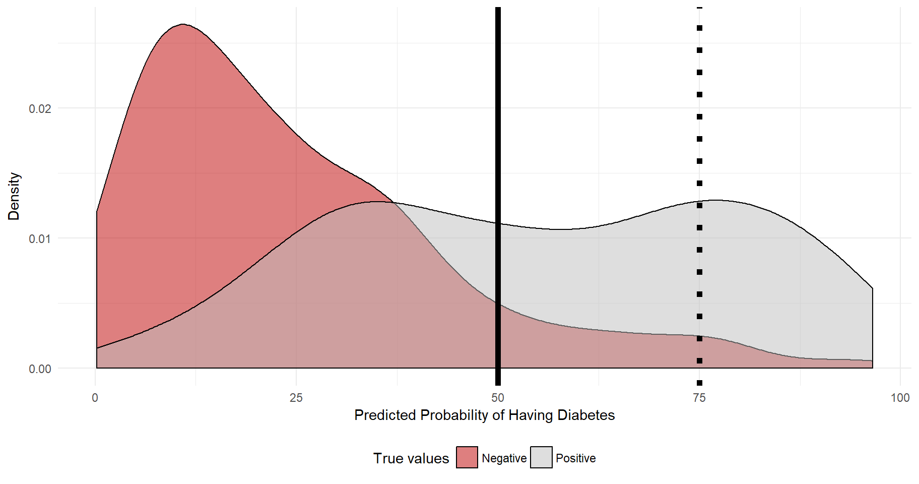
The plot reveals that most individuals that in reality have a negative diabetes diagnosis also have quite low levels of predicted probability of diabetes. As for the diabetes positive individuals, quite many have a predicted probability of 50% or more. A central question is to determine at what level of predicted probability we should use to assign a diagnosis (positive or negative) to each patient. The outcome needs to be binary! The dashed line at 75% indicates that if we were to say that every individuals whose predicted probability is 75% or more will be assigned a positive diagnosis, then we would have a fairly low level of “true positives” as the true positive distribution, unfortunately, is not super-skewed to the right. However, at 75% we would have a fairly low level of “false positives”.
The relationship between “true positives”, “false negatives”, “true negatives”, and “false positives” can be illustrated using a Receiver Operating Characterstic Curve (ROC Curve). It is possible to retrieve and plot the relationship between true positives and false positives with library(ROCR). However, becomes quite basic. Instead, I will use the values, put them in a tibble and using library(ggplot2) for the plot. Using geom_ribbon(), it’s possible to shade the area under the curve. As you may recall, the 45 degree lines indicates a model in which true positives are detected at the same rate as false positives. A good model would have a higher area under the curve. The red area is 0.5. The grey area is the gain from a non-random model.
library(ROCR)

#Get true positives and false positives
tmp <- prediction(predictions=as.numeric(log_pred), labels=as.numeric(test.db$diabetes))
prf <- performance(tmp, measure = "tpr", x.measure = "fpr")

#Add the FP/TP values in a tibble and plot them using ggplot2
tibble(FP=prf@x.values[[1]]*100, TP=prf@y.values[[1]]*100) %>%
  ggplot(aes(x=FP, y=TP)) +
  geom_path(color="darkblue", size=1) +
  theme_minimal() +
  geom_abline(intercept = 0, linetype="dashed", size=1) +
  geom_hline(ymin=0, yintercept=0, linetype="dashed", size=1) +
  geom_vline(xintercept=100, linetype="dashed", size=1) +
  geom_ribbon(aes(ymin=FP, ymax=TP), alpha=0.3) +
  geom_ribbon(aes(ymin=0, ymax=FP), alpha=0.3, fill="#be0000")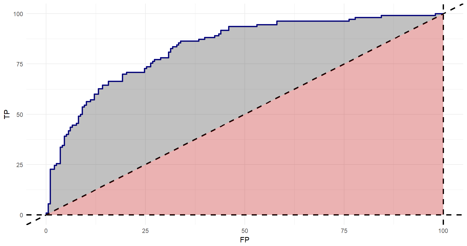
The total area under the curve can be given by:
#Getting the area under the curve (AUC)
auc <- performance(tmp, measure = "auc")
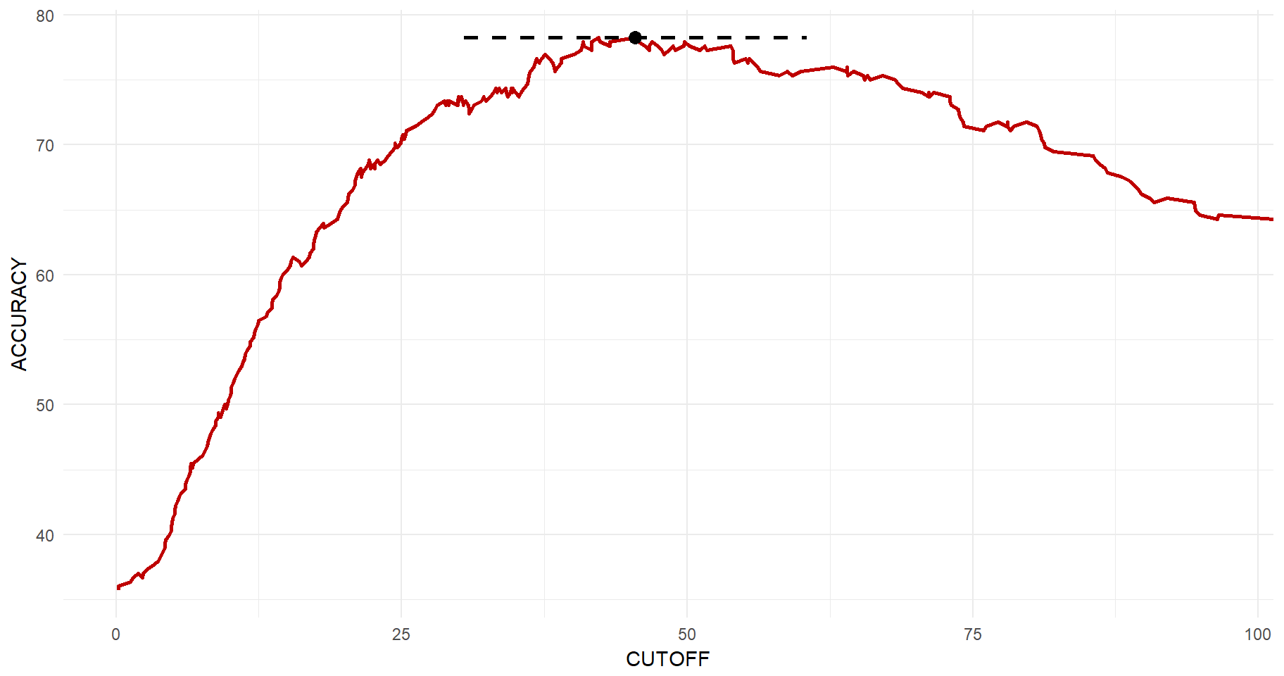
auc@y.values[[1]]## [1] 0.8339761So far, we have not settled for an optimal probability cut-off. I.e., at what level of predicted diabetes diagnosis should we draw the line for a positive diagnosis? If deciding upon on a very high cut-off, then we know that we will have low levels of false positives. However, we are missing out on many true positives. The lower the cut-off is, the higher is the chance that you will capture true positives, but at the same time the risk of false positives increases. Again, we can use library(ROCR) to get this relationship. Then the same logic applies as to before and we can get this beautiful plot in which the maximum accuracy point is clearly illustrated.
#Get the cut-off vs. accuracy
acc.perf = performance(tmp, measure = "acc")

#Get the maximum point
y_max <- max(acc.perf@y.values[[1]])*100
x_y_max <- acc.perf@x.values[[1]][which(acc.perf@y.values[[1]]==max(acc.perf@y.values[[1]]))][1]*100

#Plott
tibble(CUTOFF=acc.perf@x.values[[1]]*100, ACCURACY=acc.perf@y.values[[1]]*100) %>%
  ggplot(aes(x=CUTOFF, y=ACCURACY)) +
  geom_line(size=1, color="#be0000") +
  geom_point(x=x_y_max, y=y_max, size=3) +
  geom_segment(x=x_y_max-15, xend=x_y_max+15, y=y_max, yend=y_max, size=1, linetype="dashed") +
  theme_minimal()